


Mighty Health began as a wellness platform providing personalized 1:1 coaching for individuals over 50 through health plan partnerships. As Lead Product Designer, I spearheaded the design and transformed our web and mobile app from a digital health product into a comprehensive virtual clinic. We expanded services to include telehealth consultations, personalized nutrition plans, and structured exercise programs.
Product Design Lead
March 7, 2024 - March 8, 2025 [approx. 1 year]
Competitive and comparative research, PRD, Flowcharts, facilitating brainstorm sessions and workshops, data synthesis, user interviews, usability test, A/B Test, design system update, wireframes, UI design, deliverable hand-off
As Mighty Health transformed into a comprehensive telehealth clinic, we encountered a significant design challenge. We needed to:
- Expand services to include telehealth and personalized wellness programs
- Design dual experiences for health plan members and individual users
- Ensure seamless integration for both existing and new users
And we needed to do it quickly.
1. Begin with understanding
Through interviews, task analysis, and market research, we identified that individuals felt daunted by healthcare complexities, especially when it came to the virtual space. What they sought wasn't merely service at their fingertips—they needed a knowledgeable companion throughout their journey.
2. Design for Flexibility
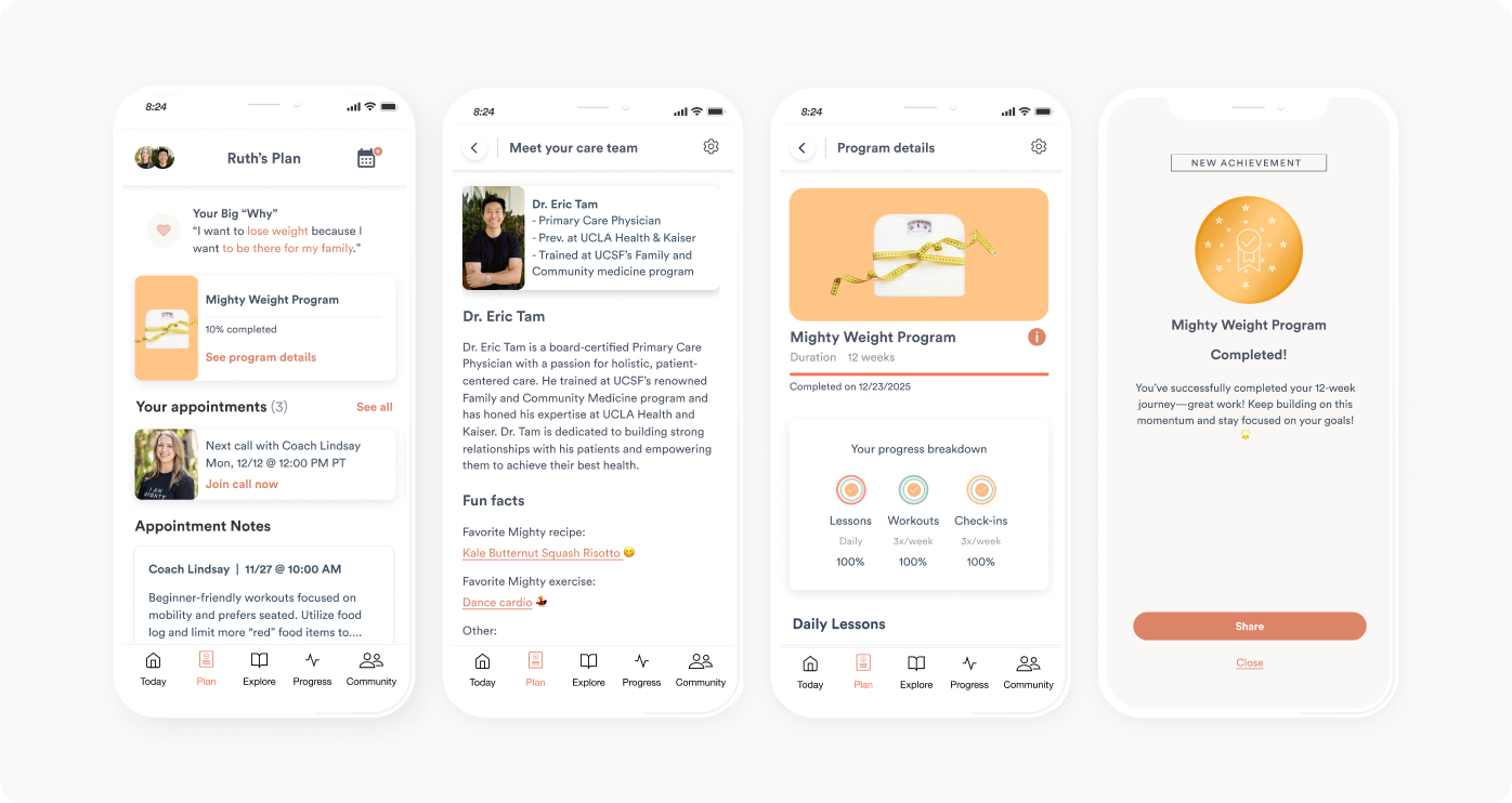
The app architecture was redesigned to be modular. This enabled seamless integration of new services such as insurance verification, appointment management, and care team visibility—while aiming to maintain simplicity.
3. Deliver a personalized experience
Our member base entailed a wide variety of health goals. It was important that we focused our retention efforts on:
- Personalized plans that provided guidance, not restrictions
- Efficient virtual care visits—streamlined processes
- Direct, transparent information regarding expenses, next steps, and available services
We tackled the entire funnel—from initial landing page to the mobile app integration.
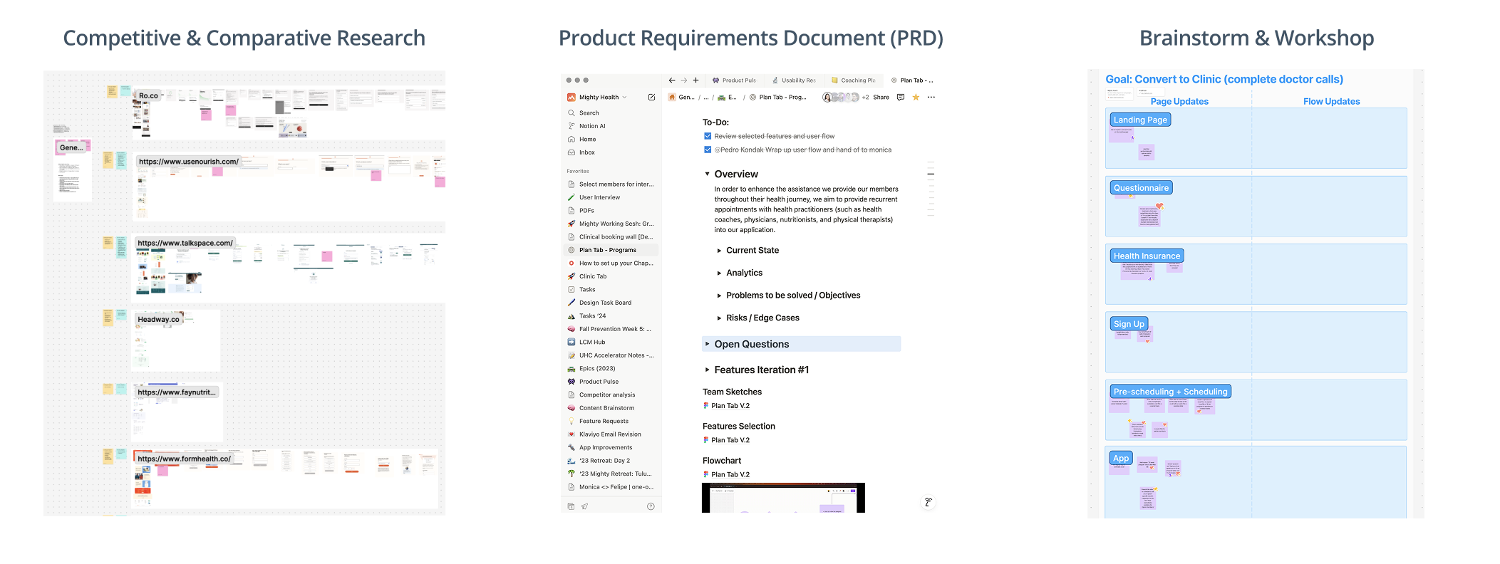
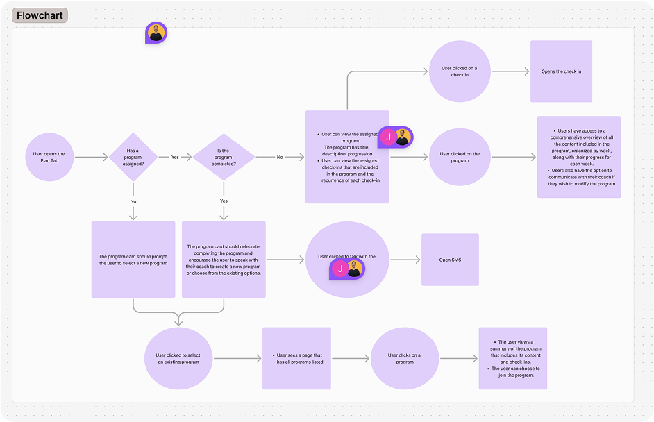
Flow charts allowed us to clarify the various pathways throughout the experience and helped us refine the back-end scope for developing efficiently. It also helped organize the information architecture across various flows.
Wireframes and prototypes brought to life our ideas and promoted many productive conversations among stakeholders. This was where expectations were challenged and fulfilled.
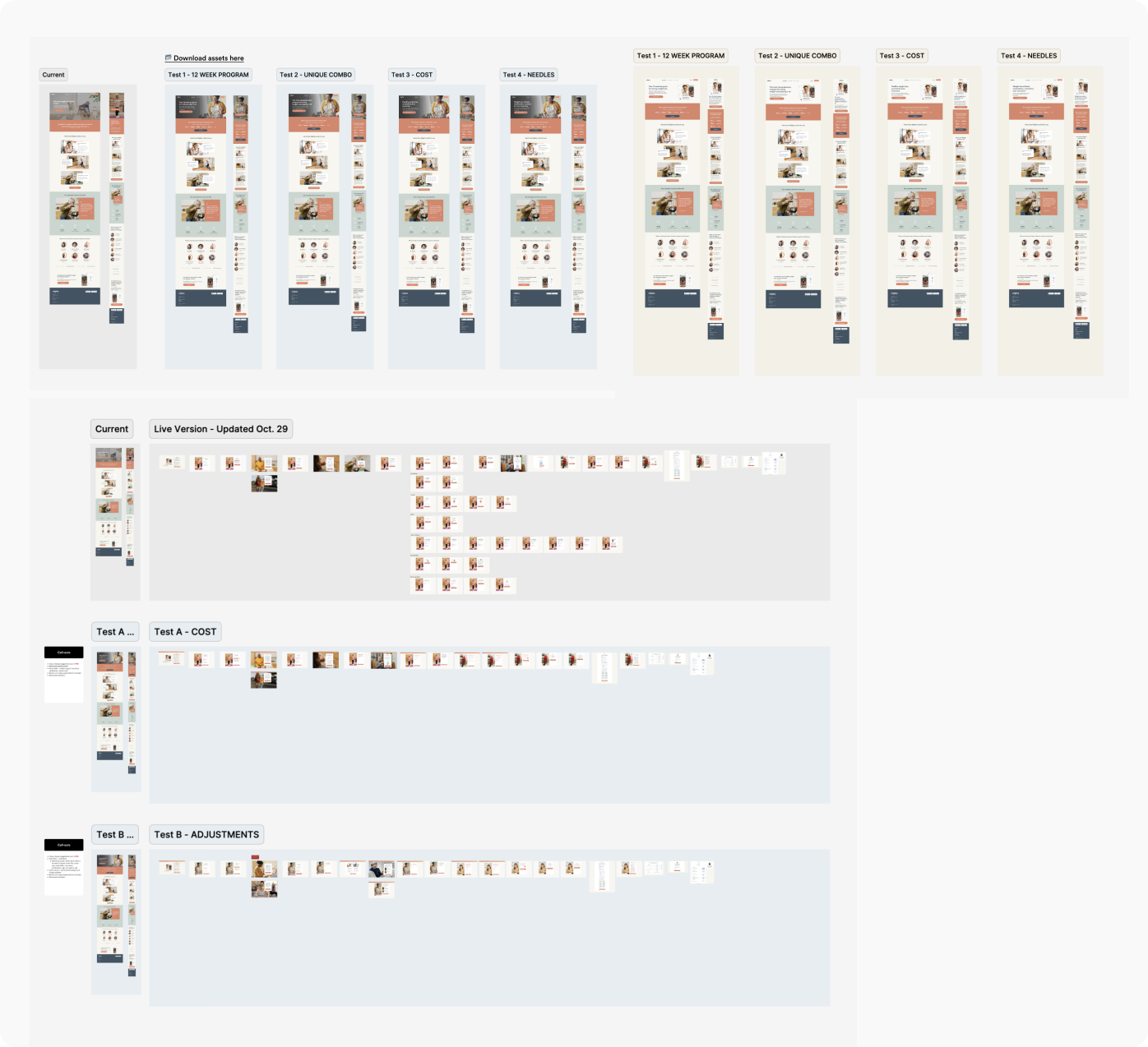
Iterative processes included design updates after receiving feedback from stakeholders, rapid A/B tests to observe engagement and retention, and sometimes even starting over on certain features if the performance was lacking. As a result, we were able to confidently narrow down our pain points and priorities.
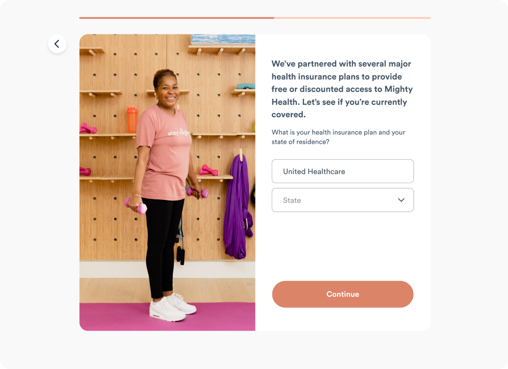
- Reluctance to provide personal information due privacy concerns, uncertainty of Mighty's offering, and fear of being scammed from other platforms
- Ambiguity around insurance coverage and out-of-pocket costs
- Unclear whether we were 100% virtual, hybrid, or in-person clinic, even with the word "virtual" mentioned across the experience
- Lack of visibility of their program, care team, and services covered by insurance
- State clearly the reason for collecting certain personal details in friendly, conversational language
- Address cost concerns by providing a range of most insured members and clearly stating step-by-step process on Mighty's end of insurance verification. Make it clear that we won't charge them anything until their eligibility is verified and their telehealth visits are completed
- Improve comms with clear messaging of next steps
- Develop features that are comprehensive, simple, and intuitive to help users quickly understand their program, meet their are team, and address insurance-related questions
I spearheaded the user interview and testing rounds by outlining ideal participant groups, crafting the questions and clarifying objectives for each round, and feeding it back to the stakeholders to inform our next stage of design improvements. There were three key takeaways:
1. Trust goes a long way-- and it's built through transparency, clear messaging, and empathy. This would encourage even skeptics to be curious and willing to see their task to completion.
2. Great care alone isn't enough. Our doctors and coaches were loudly and frequently praised for their top-tier care, but there are a few product-specific steps prior to their virtual visit that would either help them get to the finish line or disengage altogether.
3. Qualitative feedback is essential. Hearing directly from those who experienced our product for the first time helped us better understand pain points, which led to insights on how we might prioritize the next round of design iterations. It also validated some of our decisions to confirm we were on the right track.

It sounds like an obvious statement, but it's quite difficult to achieve this ideal balance in a timely manner. The care team had a standing ovation from our members, while the user experience still had ways to go to-- we had many new features that were designed and ready for development; throughout the interview process, members expressed these features would be nice to have without knowing what we had up our sleeves. The good news was that we were on the right track and added extra fuel to our tank to keep going in this direction. Some additional key learnings are:
1. Members were much more open and resilient to virtual health programs; as long as there's plenty of communiation and reassurance, people are willing to lean into their curiosity despite stepping into new territory with a virtual clinic experience.
2. Member interviews are essential. Qualitative data is irreplaceable. Having direct conversations with the users is the gold mine of insights and solutions for successful future developments.
3. Trust can be built, just as it can be broken-- with empathy, simplicity, and consistency.
The outcome was that we successfully launched an onboarding experience that increased trust and transparency, made it easy for members to know what to expect in their program, and setting up a scalable design system to build with efficiency and ease for future features. The biggest win of all was seeing members go from anxiety into curiosity and confidence, leading them another step closer to achieving their health goals.
Here are some snapshots of our clinic-focused updates:

"I need to tell you that I am going to five live concerts this summer. I haven’t been to live concerts for at least a decade. These are smaller venues or amphitheaters, and because of my two new knees and my 50lb weight loss, I am able to enjoy my life so much again. My upcoming concerts include Melissa Etheridge and Jewel. And Joni Mitchell with Brandi Carlile and others at the Hollywood Bowl in October. My life has changed and I just wanted you to know some particulars of my new joys. Thank you again!"
- Rojanne, Mighty member